Intention: Provide materials which can help a technical or non-technical person judge changes in picture and sound quality without the use of meters.
If the test equipment isn’t scheduled at the auditorium for another 6 months, is there a way to tell if the the contrast and color display is degrading? These TIFF slides are experiments to answer this question, and supply tools if it is possible. Suggestions are welcome. All these TIFF plates are 4096 x 2160, 2020 color space with 16 bits of depthiness, unless otherwise mentioned. Sound files from the DCPs will get their own page, but don’t go looking for it now…
| If you have some ideas for changes, to fix mistakes or add nuance, let us know…likely we can change the master for the better and post another version. |  This work is licensed under a Creative Commons Attribution-ShareAlike 4.0 International License. This work is licensed under a Creative Commons Attribution-ShareAlike 4.0 International License. |
| If you create something and would like it hosted on this site, please let us know. | Read what the link says on the Creative Commons site. Generally, you can use these in your works, change as required. But please, 1) give attribution when you use them in either commercial or non-commercial work, 2) provide a link to the original material and, 3) send a note to let us know what you changed. |
White2Black Dials This TIFF started as an experiment in seeing smoothness from 100 to 0 all over the screen. Really, it was striking as a color print so the logical extreme was black to white everywhere. There are 3 versions in the set, each pushing the center point of the gradient just a little to one side or the other from center. Confuse them at your own risk. And for each one there is a version with a dial. When you make your DCP, use one after the other so the talent can make a judgement without the dials, then mark down the place where any problem exists. The dials on the TIFF files look much better than what is compressed here. Please give them a try, and let us know. As Always, 16 bit, 2020 and the Passcode is QA_b4_QC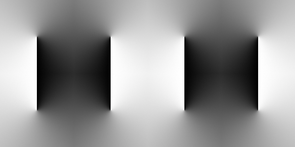
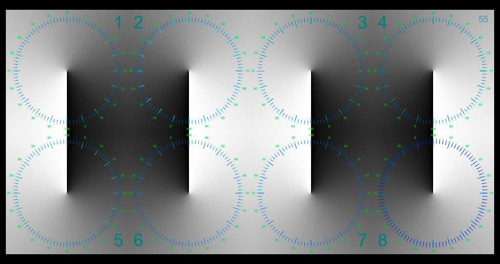
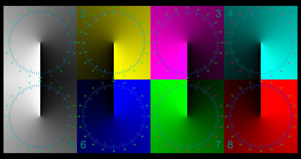
Primary and Secondary Dials These radial dials are an experiment to see if broken or funky gradients can be observed or perhaps even be seen gradually going odd over time. As Always, 16 bit, 2020 and the Passcode is QA_b4_QC 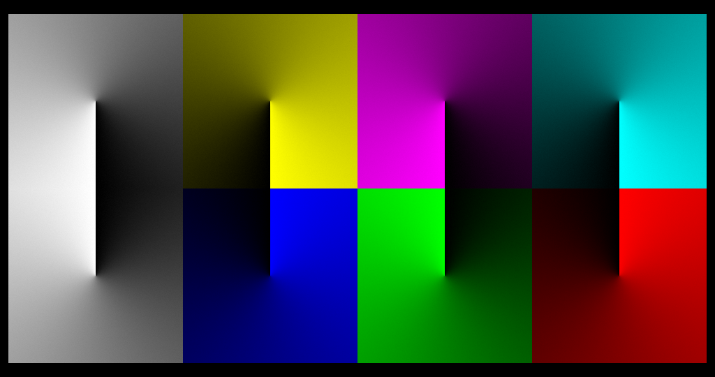
4 Colors, 10 Boxes TIFFs Once more, an attempt to see what can be seen in HDR / EXR projector systems, then to find which ones can be used to notice any degradation in the system. These would be the normal SMPTE required RP 431-2 set of blocks going across, but they also have a smooth gradient going across the bottom. …and, they don’t start at 100%. There are 3 sets, one which starts at 10% luminance and goes to 1%, another from 1% to 0.1, and – you guessed it, the 3rd set goes from 0.1% to 0.01%. Thus, with 65,535 as 16 bits, the range of these goes from 6,553 to 7 units of color. More specifics at the download page… For some reason, I made a Rec 709 PNG at 6554 – 655 with outline and it doesn’t seem to show on the computer screen. Well, just a bit if you look sharp. So, this is the 4th of this series, attempting to find an objective measurement technique to quantify changes. The link above gives you a set of TIFFs. And at this link (soon as it is made), there is a DCP. Let me know what works please. 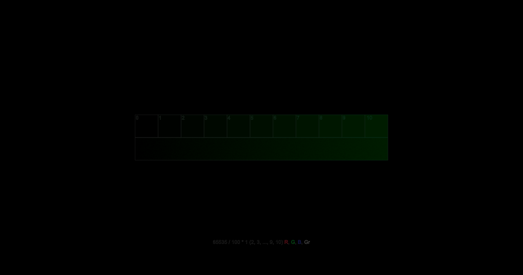
Vertical Meters TIFFs The question for these slides is “Can you objectively and consistently judge where the color ends and only black exists”? Will several people see the same ending point. The underlying question is can the meters be used as tools to objectively judge contrast? If there is a lot of dust on the port window or in the room, will there be a difference? On each slide there are 16 bars of color, 8 starting at 5% luminance in the center and going to 0% at top and bottom, and 8 going from 2.5% and going to 0%. One the left is a set of 4 of each for RGB and White on the left, and the right side is a complete set, through in a different order. The idea was to see if a bright color like green made it too hard to judge the blue if they were adjacent. Indeed, these are experimental. In addition to 5/2.5, there is also a slide with 2.5% and 1% meters, and for those with an extraordinary system, 1% to o.1%. Is 5% a usable meter for each color or is 2.5% more useful in a xenon powered room? The theory is that one can look at the meter and make a substantially objective judgment, record it on one of the checklists, and use the test again a week or month later to note if there are changes. Wow! This PNG only begins to show a usable scale…download the TIFF file. 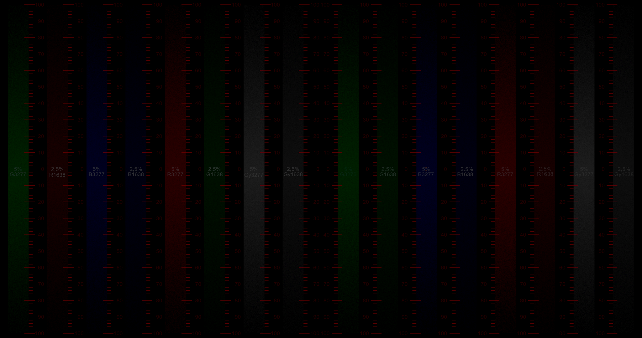
Dials for Contrast: 6%, 4.5%, 3%, 1.5% RGB and Greys, with and without tic marks. This idea is similar to the vertical meters above, but as dials with the gradient from 6% to 0% (as well as 4.5% and 3% and 1.5% to 0) on a dial, and in several colors. There is a version with a set of tic marks to note where the last point of seeable color is…and a version without. Why? Because it may be that one needs to spot the position of where the color disappears, without the influence of the dial markings, then get the markings later. In the DCP the dials show for 5 seconds then the dials with the tic marks and numbers show together for 5 seconds. Experiment and report please. RGB and Greys. 2020. 4K and 16 bits of depth for each color. All to see if we can get an objective tool that an interested and intelligent person can use. A little trouble making a file that shows on the screen at such low luminance. Try the TIFFs. 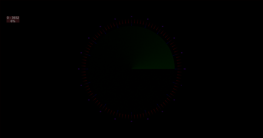
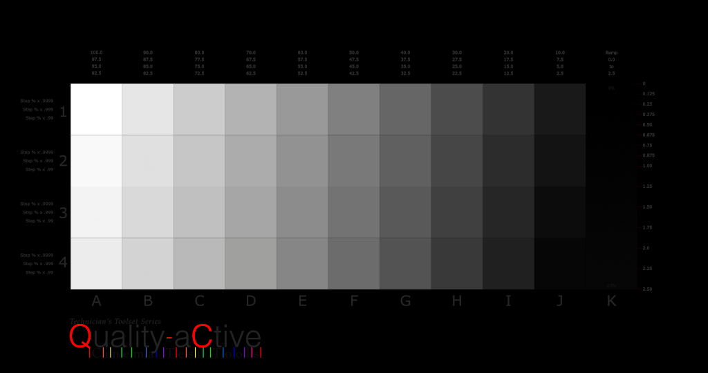
Grey Steps with Dirty Numbers The classic row of grey boxes is defined in SMPTE RP 431-2: D-Cinema Quality – Reference Projector and Environment document. One row in the center of the screen. Problem is, it isn’t a very good test of a modern digital cinema projector, is it? This TIFF file has every square of grey from 2.5% to 100%, plus a ramp from 2.5% to 0%. And above that is a set of numbers, that give the luminance value of the square…but it gives it 3 times, and the digits are in three different values. The bottom value is 1% lower, and the middle is 0.1% lower and the top number…hopefully able to be seen in that fancy million to one system, is 0.01% different. The trick is to see if these numbers show up on a screen. Have fun and do share your thoughts. As always, 2020 color space and 16 bits of depthiness. The DCP is at: GreyStepScales These are the numbers that are laid on top of the squares…can your system produce differences for some or most of them? 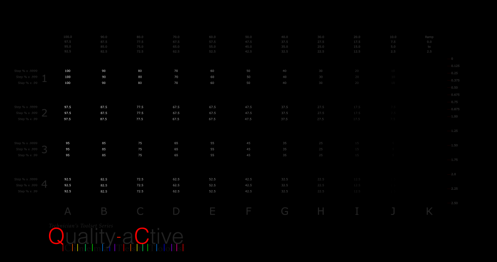
2117 5 Percent Solution These Dots are made for testing. These two TIFF files are one for Scope and one for Flat with the dots placed on a 5%W line as specified in 296M. Have fun and do share your thoughts. As always, 2020 color space and 16 bits of depthiness. More info is on the actual download site. 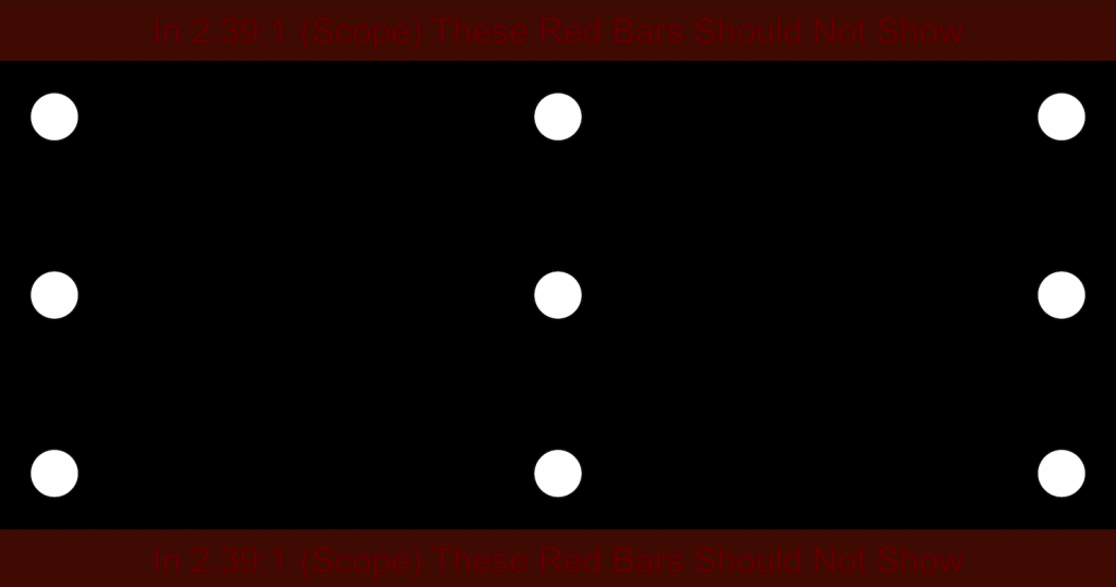
2117 Test Plates 1a These Dots are made for testing. First to check that they are usable, and 2nd for putting on the front screen and testing for luminance without glare. There are two sized dots, 10% and 20% of height. They sit on a rectangle that is 15% in from the edges of the Flat or Scope screen. There are 4 type of TIFF files for each Flat and Scope, two 10% and two 20% but one each for 1.90 Full Frame and one each for 2.39 Scope (top and bottom cropped off for a 1716 pixel height) and a 1.85 Flat (with the edges cut off for a 3996 width.) As always, 2020 color space and 16 bits of depthiness.
Primary and Secondary Trumpets Each of these components will be made available in a kit, but for right now, here they are in one chart. 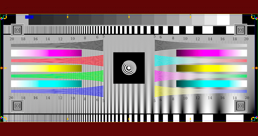
Mach Band Effect Testing Plates There is a whole series to download here. These were developed to learn whether the black of the masking curtains and the typical vignette of the picture cause the illusion of luminance shift. 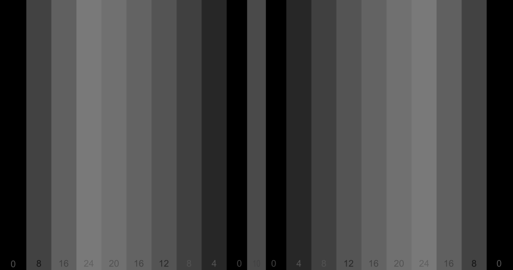
Horizontal and Vertical Lines – Black, against backgrounds, 2020, 4K Black lines at every other position on the grid…and a variety of different primary and secondary backgrounds. 
Horizontal and Vertical Lines – Colored Lines, 2020, 4K What is the difference to a projector or a LED wall between drawn black lines and backgrounds of colors…which actually fill in the alternate lines, right? …and drawing the colors as the lines and letting the editing program put in the background…or no background at all. You too can find out with these plates. 
Color Plates, 2020, 4K Primary and secondary color plates – Don’t need pictures of those here, do you? Just get them at the download site.
2 Percent Hmmm – What shall we call this? It is derived from the CST chart that marks off 2% rectangles to begin with, and a bunch of circles drawn at the proper 10% points…then it got botched up with moving the color wheels to align with the corner to corner lines which actually serve no purpose…ok, toss in some focus squares …that’ll distract them. (This png is 709…get the real thing in 2020 and tell us how to make it better please. 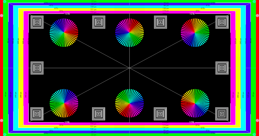
2 Percent, Black and White Hmmm – What shall we call this? It was inspired by/is derived from, the CST chart that marks off 2% rectangles to begin with, and a bunch of circles drawn at the proper 10% points…then it got botched up with moving the color wheels to align with the corner to corner lines which actually serve no purpose…ok, toss in some focus squares …that’ll distract them. (This png is 709…get the real thing in 2020 and tell us how to make it better please. 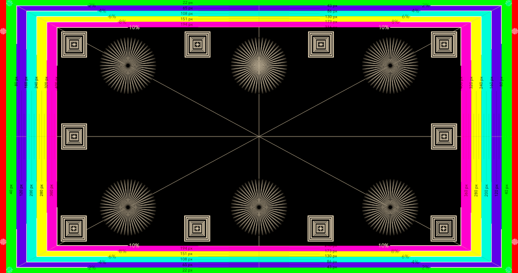
CJ’s Favorite Distraction Several variations with several colors going from full saturation to dark or white …and grey level tests too. A distraction because I keep refining it. Now with MTF marks – hope they work…haven’t tested them yet.
Trumpets 8 TIFFs of Trumpets. The ability to watch as lines get closer together. There are many variations…there are numbers in there somewhere. Experiment and report please. RGB and Black. 2020. 4K and 16 bits of depth for each color. All to see if we can get a subjective objective. 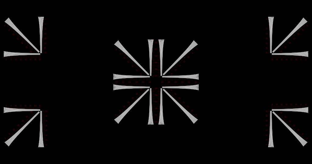
Circles and Stars Circles and Stars and a few other things to stare at. And some fun while making the primaries turn into secondaries. Ya gotta love bluey yellow, no? The alternative TIFF uses outlines of the Siemens Stars for the center position, just to see what detail they hold. No idea if a 4K system can hold 48 spokes…let us know what you find please. RGB and Black. 2020. 4K and 16 bits of depth for each color. 
Coming….Colors, Stripes, Dials, MoreMTF –